Home Case studies BOSS Money
Consumer fintech · Money transfer
BOSS Money
I spent 18 months leading a five-person design team, redesigning the BOSS Money app and website, and building the system behind both. Conversion went up, and the product stayed clean.
This project covered the website and the mobile app. Five designers worked from one shared system, but each surface kept its own job: the website explained and reassured; the app helped people move money without second-guessing every tap.
What changed
One reusable system replaced a pile of one-off screens
Money-transfer journeys became cleaner and easier to follow
Accessibility lived in the shared components from the start
Conversion improved without making the app louder
Five designers worked from the same set of rules
Amplitude tests settled product debates with evidence
The website and app felt related without becoming copies of each other
By the numbers
A little context
18 months
Design and product work
We built the system, used it, found the weak bits, and fixed them.
5 designers
One integrated team
Two UI, two UX, and one graphic and motion designer.
↑ conversion
What changed
Amplitude tests showed which versions worked better for customers.
The calls
What I kept coming back to
The details changed. These did not.
Solve repeats once
When the same problem appeared twice, we agreed on a shared pattern. The library stayed useful instead of becoming a graveyard of old components.
Remove noise, keep the answers
We cut clutter, but fees, rates, timing, and transfer status still had to be obvious when they mattered.
Different skills, same product
UI, UX, graphic, and motion designers brought different strengths. Shared rules and reviews stopped the app feeling like five people had designed five different products.
The job
The product needed more than nicer screens
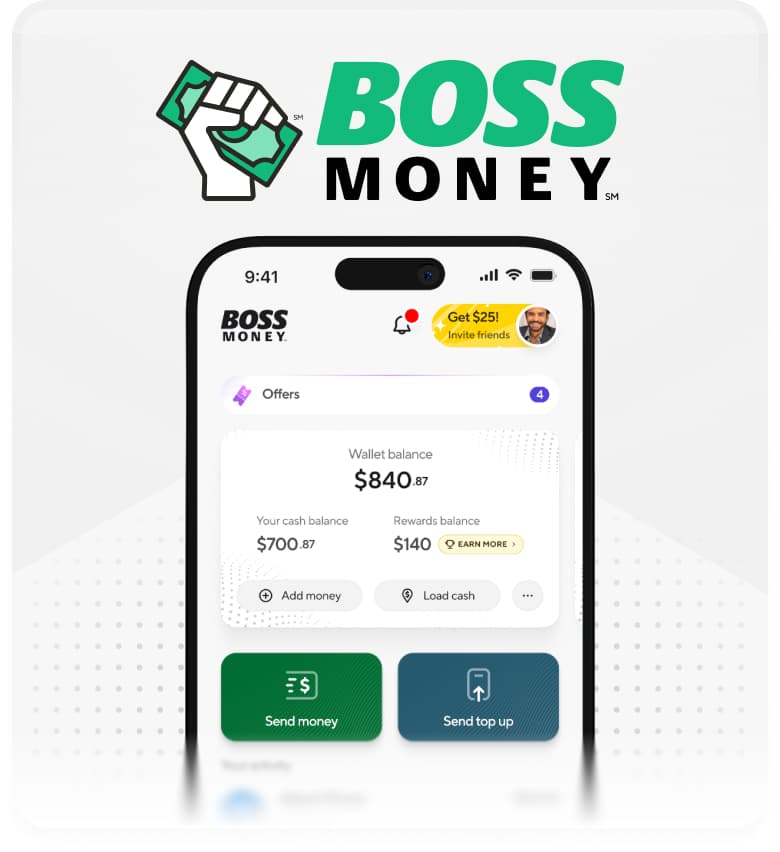
BOSS Money already did a lot, and more features were coming. The website had to explain the service clearly; the app had to make sending money feel safe and straightforward. Redesigning a few screens would have made a nice portfolio image, then left the team with the same old problems.
We needed to improve the journeys that affected conversion, calm down the interface, make it more accessible, and build reusable parts for whatever came next.
What mattered
More completed journeys, fewer cheap tricks
We wanted more people to complete important journeys, but not by shouting louder, hiding details, or turning every screen into a promotion.
We used clearer hierarchy, fewer competing actions, accessible controls, and better timing for important information.
- Make the primary action unmistakable without making everything else disappear.
- Keep fees, rates, timing, and recipient details close to the decision.
- Reduce friction for repeat customers while keeping important checks visible.
- Improve conversion without making accessibility someone else's problem.
Web + app
Shared foundations, different jobs
The website introduced BOSS Money, answered the obvious trust questions, and helped people understand why they should use it. The app handled balances, recipients, rates, fees, transfers, and all the nervous moments that come with moving real money.
We used the same type, color, controls, accessibility rules, and brand behavior across both. We did not copy layouts blindly. The website had room to explain and persuade. The app stayed focused on getting the money where it needed to go.
- Use the website to explain the offer before asking people to act.
- Keep the app focused on decisions, status, and the next useful step.
- Share foundations and components where they genuinely fit.
- Let web and mobile behave differently when the job calls for it.
The mess
The same problems had too many different solutions
Money transfer already comes with plenty of complexity: country rules, payout methods, identity checks, limits, reviews, and support states. Inconsistent UI adds a completely avoidable layer on top.
Similar actions looked and behaved differently depending on where they appeared. We kept solving familiar problems again, and customers had to relearn patterns inside the same app.
- Repeated patterns had drifted into slightly different versions.
- New features could add visual noise faster than the product could remove it.
- Happy paths looked considered; edge cases did not always feel related.
The system
How we built the system
We organized the work from small pieces to full journeys: foundations, controls, components, patterns, templates, and screens.
A button did not become reusable just because we put it in a library. It needed clear states, accessible behavior, sensible content rules, and enough flexibility for real product work. We built larger patterns from those same parts, so screens felt related without becoming copies of each other.
- Shared foundations for type, color, spacing, elevation, and motion.
- Reusable controls with documented states and accessibility built in.
- Patterns for forms, transactions, status, errors, reviews, and promotions.
- Templates that gave teams a strong starting point without locking them in.
The team
Five designers, one product
The team included two UI designers, two UX designers, and one designer covering graphic and motion. That gave us a good mix of skills, as long as the work joined up.
UX designers shaped the flows and product logic. UI designers worked on hierarchy, interaction, and reusable patterns. Graphic and motion design gave the app a recognizable voice and made movement feel deliberate. The design system connected their work, and we reviewed the product together instead of throwing files over the wall.
Everyone owned their part, but nobody vanished into a specialty and came back with something that looked unrelated to the rest of the app.
- Give each discipline clear ownership without creating handoff walls.
- Review journeys as one experience, not as separate UX, UI, and motion files.
- Treat the design system as a team tool, not the UI designers' private library.
- Let specialists challenge the system when real product work exposed a weak rule.
The work
We used the product to test the system
We worked on the product and the system together. Real flows exposed weak components. Fixing those components made the next flow faster to design and build.
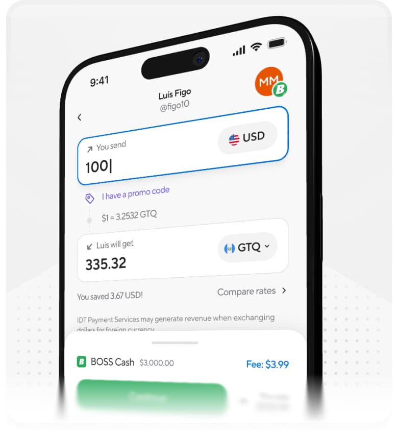
We used the send-money journey as a serious test. Amounts, rates, recipient details, payout choices, validation, reviews, and tracking all had to remain clear across many states. If the system could handle that without becoming a mess, it could handle most of the app.
- Review repeated product problems before adding another component.
- Test components in messy, realistic states—not tidy library examples.
- Use Amplitude A/B tests to compare ideas and make the next decision with evidence.
- Work closely with engineering so reuse survived implementation.
What shipped
Cleaner screens and fewer one-offs
Customers got clearer hierarchy, more consistent controls, and fewer moments where the interface competed with itself. The important money-transfer journeys became easier to scan and easier to complete.
The team also got reusable foundations, components, patterns, and templates. New work started from something solid instead of another blank frame.
A closer look
The website and app, side by side
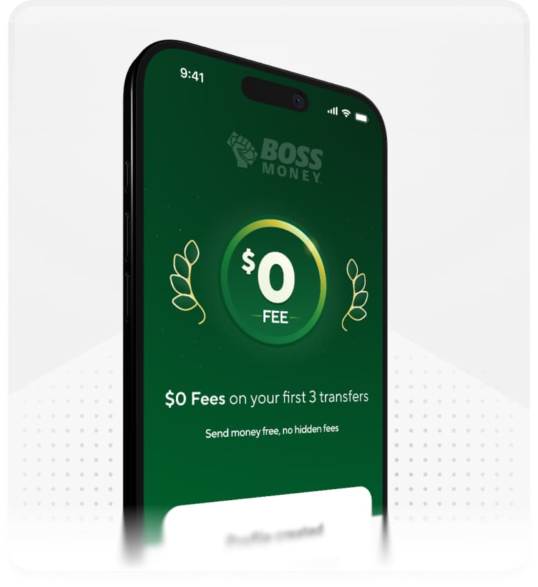
The website explained the offer and built trust. The app handled balances, recipients, rates, fees, and transfers. Add one strong overview from each surface here.
A closer look
Shared foundations, different jobs
The same system connected both surfaces. These slots are for proof: shared rules, how those rules changed between web and mobile, and one experiment that affected the final product.
Result
We tested it, and conversion improved
We used Amplitude to run A/B tests, compare versions, and see what happened in real journeys. The results told us what to keep, what to change, and which popular ideas were not actually helping.
The redesigned journeys improved conversion while the app stayed clean and accessible. We turned the good parts into patterns the team could keep using.
Product and engineering could use those patterns in the next flow, so new work started closer to the right answer. The app became more consistent for customers and less repetitive for the people building it.
- Higher conversion across product journeys tested through Amplitude.
- A cleaner and more accessible customer experience.
- Reusable patterns that reduced one-off design and implementation work.
Looking back
The awkward screens kept the system honest
A polished happy path is easy. The real test is a validation error, a transfer under review, a long translated label, or a feature the original component never expected.
Because we built the system in the product, it already knew about the messy parts. It was not a tidy library pretending the app was simpler than it really was.
The bit that mattered
The design system was how we kept adding to a complicated financial product without making it harder to use every time it grew.