Home Case studies NoraGO
IPTV · TV, mobile, boxes, and web
NoraGO
I worked with two UI/UX designers to build NoraGO from scratch: one IPTV product system for TVs, set-top boxes, Android boxes, phones, and the web.
A closer look
A TV app providers could make their own
Theming, the opening sequence, and even the app icon belonged to the same product. Branding could change without turning every provider into a separate fork.
The hard part was not drawing more screens. It was making one product feel natural on a TV across the room, a phone in your hand, a box under the TV, and a browser on your desk.
What changed
One product system covered every supported screen
TV interactions were designed for a remote, not copied from mobile
Theming could change the brand without changing how the product worked
Accessibility settings made it into the React Native app
By the numbers
A little context
3
Designers
I worked with two UI/UX designers and we reviewed the product as one team.
5
Platform families
TVs, set-top boxes, Android boxes, phones, and web all came with different input rules.
Zero → one
Product system
We started without a shared system and built the foundations, patterns, and screens together.
The calls
What I kept coming back to
The details changed. These did not.
A remote is not a mouse
Focus, distance, and directional movement shaped the TV experience. Hover states and tiny targets were useless there.
Same rules, different behavior
The platforms shared type, color, content, and product logic. Interaction changed when the device demanded it.
Themes should not break the app
Providers could change the brand, but contrast, focus, hierarchy, and navigation still had to hold up.
The job
Build one IPTV product for every screen people already owned
NoraGO had to run almost everywhere: smart TVs, set-top boxes, Android boxes, mobile phones, and the web. Each screen had a different input method, viewing distance, performance limit, and reason to exist.
The easy answer would have been to shrink or stretch the same interface. That would also have been a bad answer. We needed one recognizable product without pretending every device worked the same way.
The reach
Same catalog, five very different places to watch it
On TV, people sit far away and move one focus point at a time with a remote. On mobile, they search and browse with one hand. Set-top and Android boxes add their own hardware limits. The web has a mouse, keyboard, and much more space.
We shared the product model, foundations, and language across them. Navigation density, focus behavior, gestures, and layouts changed where they needed to.
- TV interfaces stayed readable from across the room.
- Remote focus always showed where the next action would happen.
- Mobile used touch patterns instead of copying TV navigation.
- Web had room to show more without becoming a control panel.
Starting from zero
We built the product system while we built the product
There was no finished library waiting for us. The three of us created the foundations, components, patterns, and screen rules from scratch.
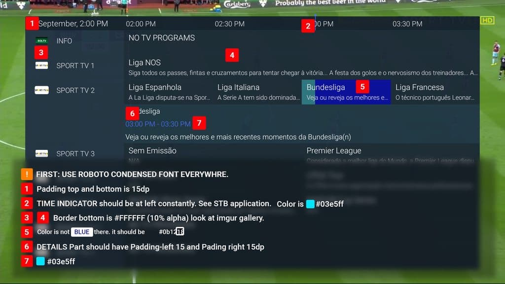
We started with real product work: focus states, channel rows, metadata, buttons, playback controls, settings, search, and empty or error states. When a pattern repeated, we made it reusable. When a device exposed a weak rule, we fixed the rule instead of adding another exception.
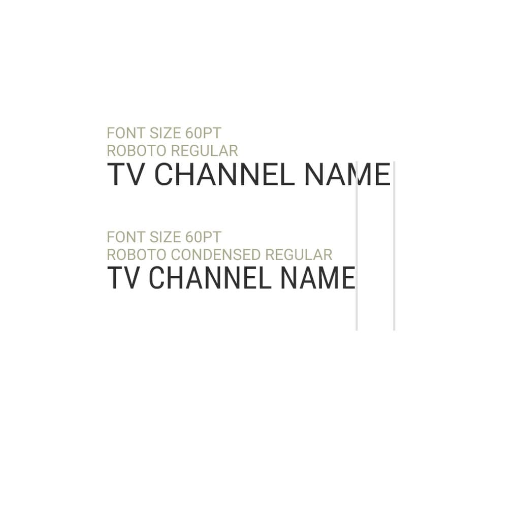
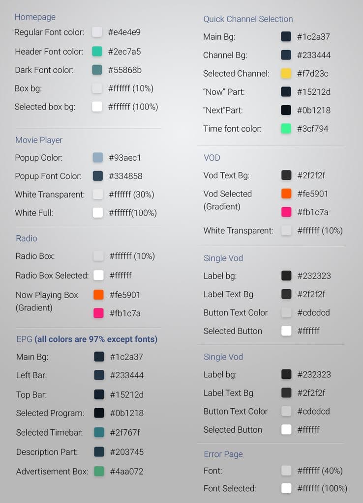
- Foundations for type, color, spacing, focus, and motion.
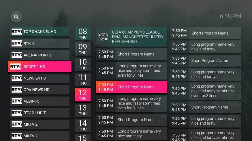
- Reusable patterns for live TV, VOD, EPG, search, and playback.
- Theme tokens that let providers change the brand safely.
- Platform rules documented beside the shared components.
Ten feet away
The TV work started with focus, time, and a remote
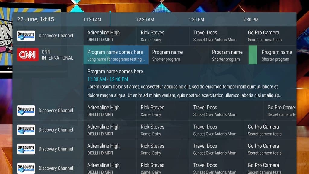
TV UX has no forgiving cursor. If focus disappears, the interface feels broken. If the EPG is too dense, nobody can scan it. If changing episodes takes people out of playback, the product gets in its own way.
We treated live TV, catch-up, VOD, and episode selection as connected viewing jobs. The motion helped people understand where they went. It was never decoration pasted on at the end.
In the hand
Mobile needed speed, touch, and accessibility that actually shipped
The mobile app had the same content, but a different rhythm. Search had to be quick, results easy to scan, and the next action reachable without a tour of the interface.
I also coded the accessibility settings in React Native. That mattered because implementation quickly exposes vague design decisions. Contrast, text behavior, controls, and settings had to work in the product, not only in Figma.
Three designers
We divided the work without dividing the product
I worked with two UI/UX designers. We could each own an area, but we reviewed the journeys and the system together.
That kept TV, mobile, and web from becoming separate design languages. It also meant a useful solution found on one platform could improve the others without being copied blindly.
What shipped
A system you can see moving, not just a component library screenshot
The work shows up in the product: branded TV themes, opening motion, app icons, EPG navigation, smart catch-up, VOD, episode selection, mobile search, and accessibility settings.
The clips below are the case study. They show how the system behaved when someone actually used it.
A closer look
The TV experience had to survive real viewing
People jump between what is live, what already aired, and what they want to watch next. These flows had to work with a remote and remain clear from across the room.
A closer look
Mobile was its own product, not a small television
Search and accessibility were designed for touch. I coded the accessibility settings in React Native, which made the decisions face the reality of the app.
A closer look
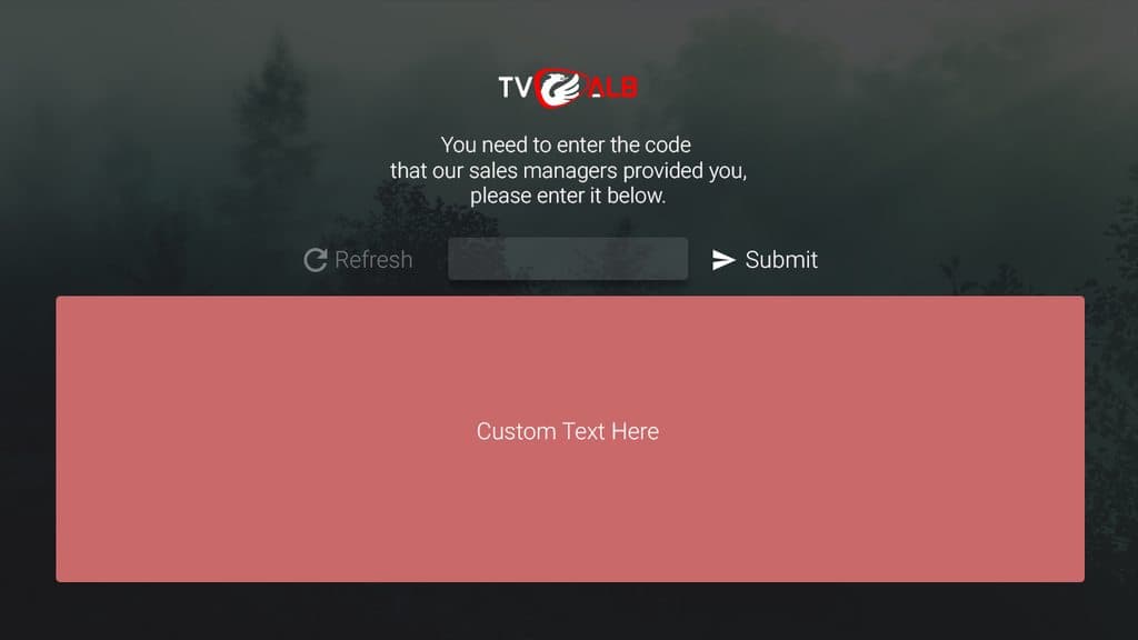
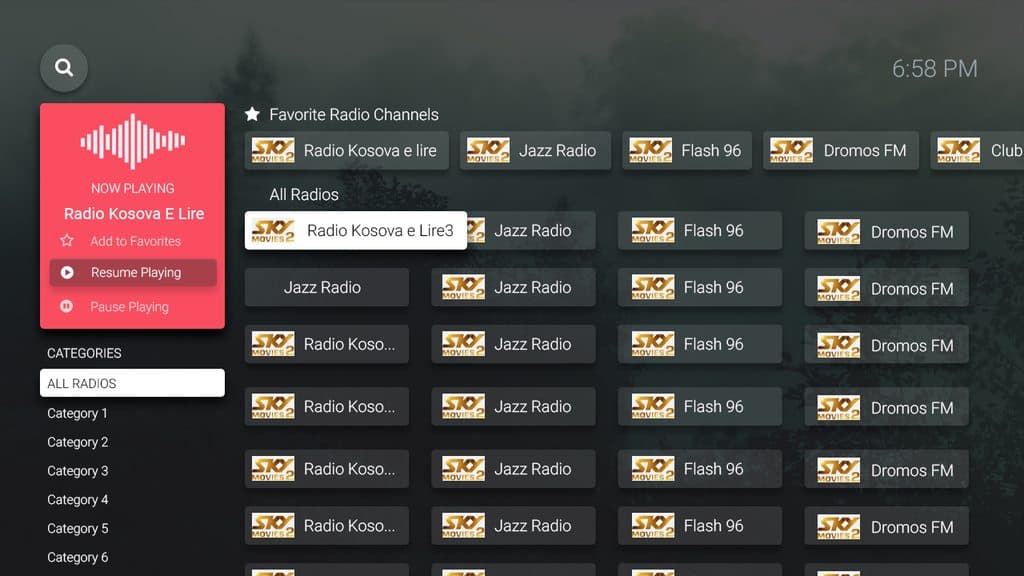
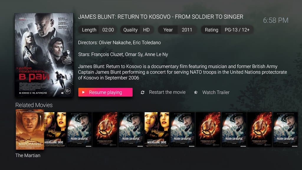
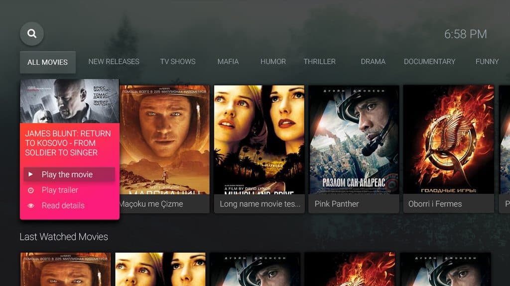
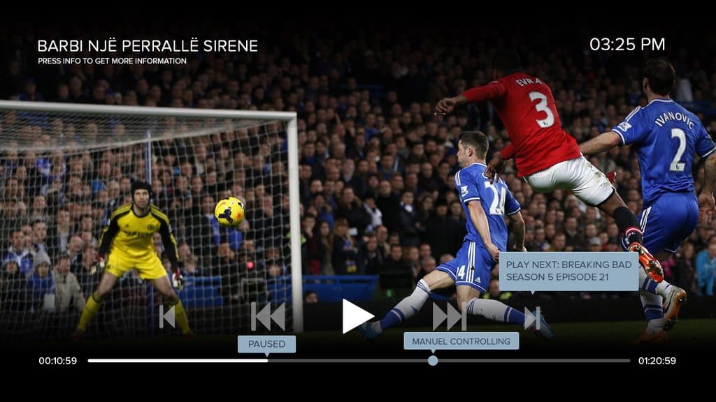
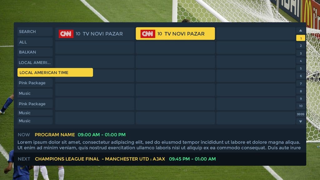
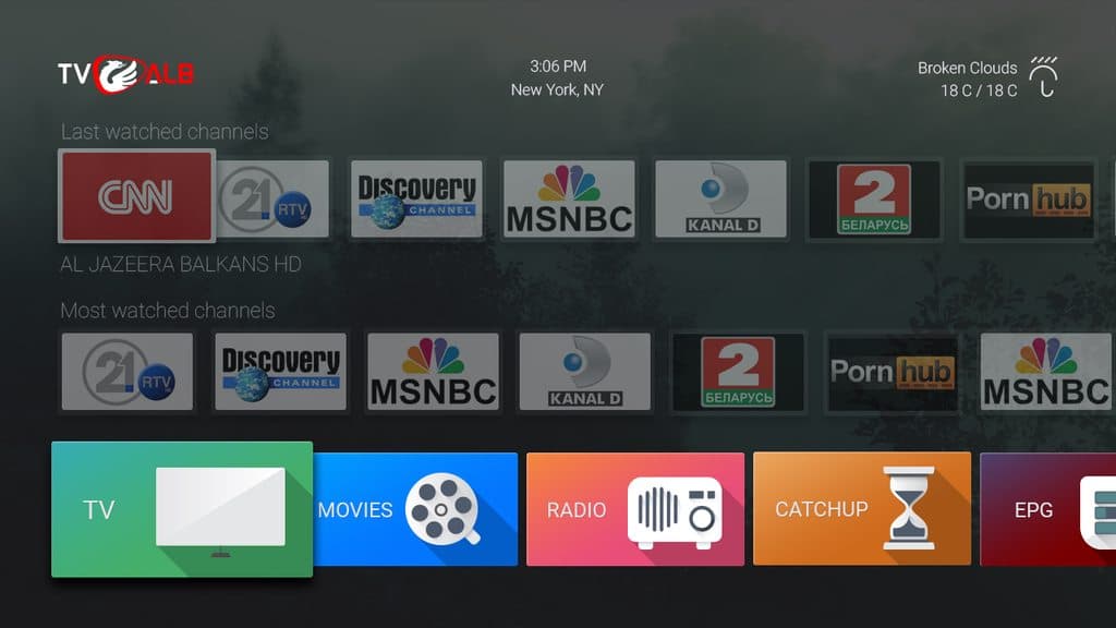
The Android app, screen by screen
A selection from the Android app. The full gallery is linked at the end of the case study.
Looking back
Cross-platform does not mean identical
The strongest decision was building one system without demanding one layout. The shared rules made NoraGO feel related everywhere. Respecting the device made it usable everywhere.
I would use the same test again: share the product logic, share the visual foundations, then let the input method and viewing context tell you what must change.
The bit that mattered
One system did not mean forcing every device into the same layout. It meant agreeing on the product rules, then respecting how people actually used each screen.