Home Case studies zendit
B2B SaaS Product
zendit
I joined zendit before it had a brand. It started with a logo and website. Then I ended up designing the client console, admin tools, and nearly everything in between.
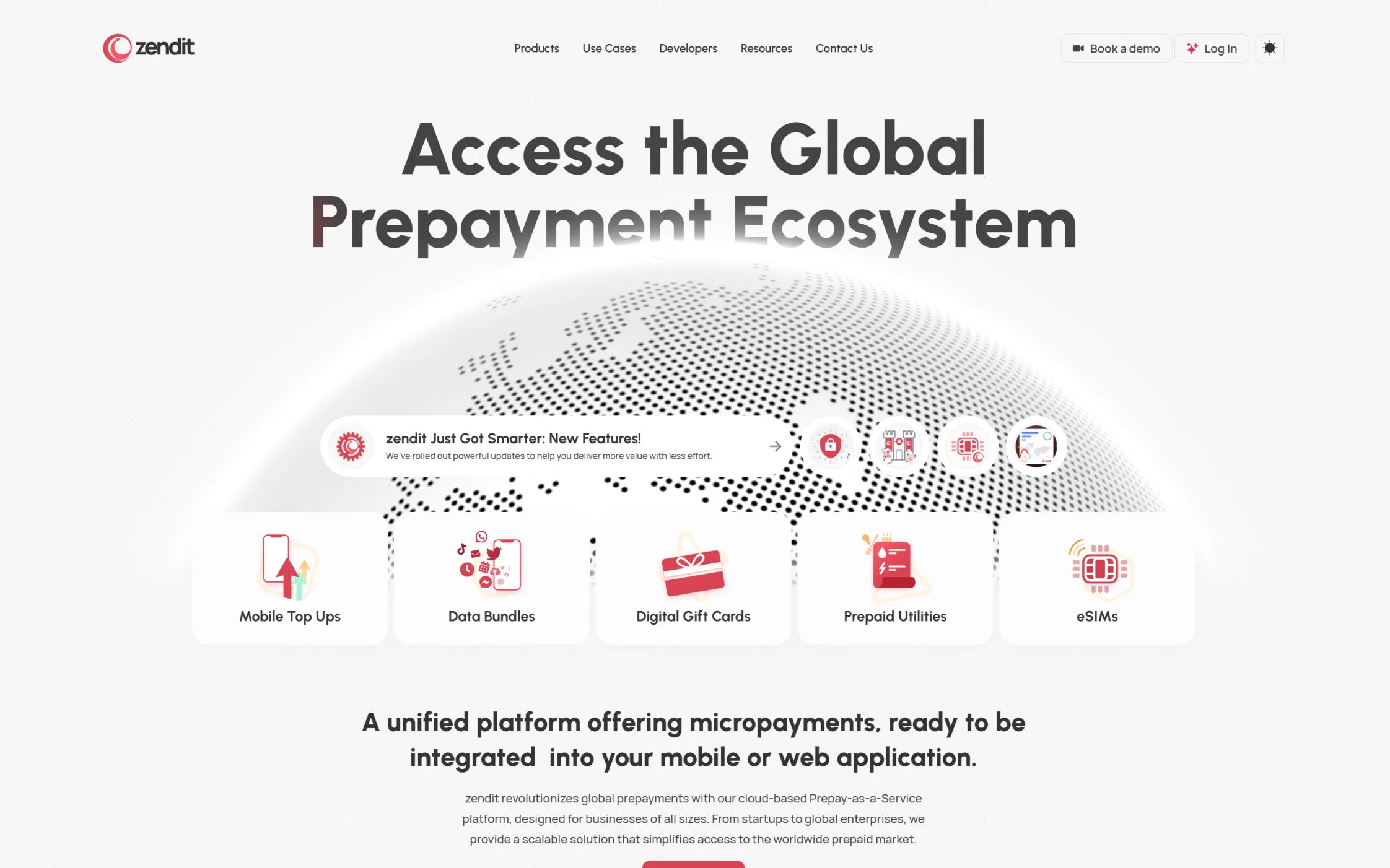
zendit had a capable platform, but explaining it was painful. The website and product also looked like strangers. Fixing both became my job.
What changed
People could tell what zendit sold without studying the entire catalog
The website, client console, and admin tools looked like the same company
Catalog, wallet, reporting, alerts, and account work became easier to scan
Teams had icons, components, templates, and guidelines they could actually reuse
By the numbers
A little context
16k+
Products in catalog
Enough inventory to make search, filters, and comparison core product problems.
190+
Countries
Coverage had to be easy to grasp without turning every page into a wall of country names.
800+
Partners
A buyer choosing infrastructure has different expectations than someone downloading a consumer app.
The calls
What I kept coming back to
The details changed. These did not.
Explain the product before listing features
Buyers first needed the simple version: one place to source and manage prepaid products. The catalog details could come later.
The screens had to back it up
The catalog, wallet, reports, and account screens showed that the platform could handle real work. A nice landing page was not enough.
Make it usable without me
I documented the visual rules and reusable pieces so every new page, feature, campaign, or event did not need me to start from zero.
Before I touched it
A useful platform that took too long to explain
zendit connects businesses to thousands of prepaid products through APIs and a management console. One customer might be adding airtime top-ups to a wallet; another might be offering eSIMs, gift cards, or utility payments.
The range was useful, but it made the company hard to describe. There was no brand, no shared product language, and no easy way to show buyers how the pieces fit together. I joined while the team was still working out what zendit should look and sound like.
What I signed up for
The job kept growing
I was hired to make a visual identity and marketing site. That lasted about five minutes. The promise on the website had to match the software behind it.
I ended up working across the client console, internal admin tools, product UX, frontend, icons, illustrations, and brand guidelines. A buyer should have been able to move from a landing page to a product screen or sales deck without wondering whether another company had taken over.
- Explain what zendit does without making visitors learn the entire catalog.
- Show enough real product detail to earn trust from technical and business buyers.
- Make dense operational screens faster to scan and safer to use.
- Create reusable visual rules instead of a collection of one-off designs.
Where it got messy
The catalog was huge. Hiding it was not an option.
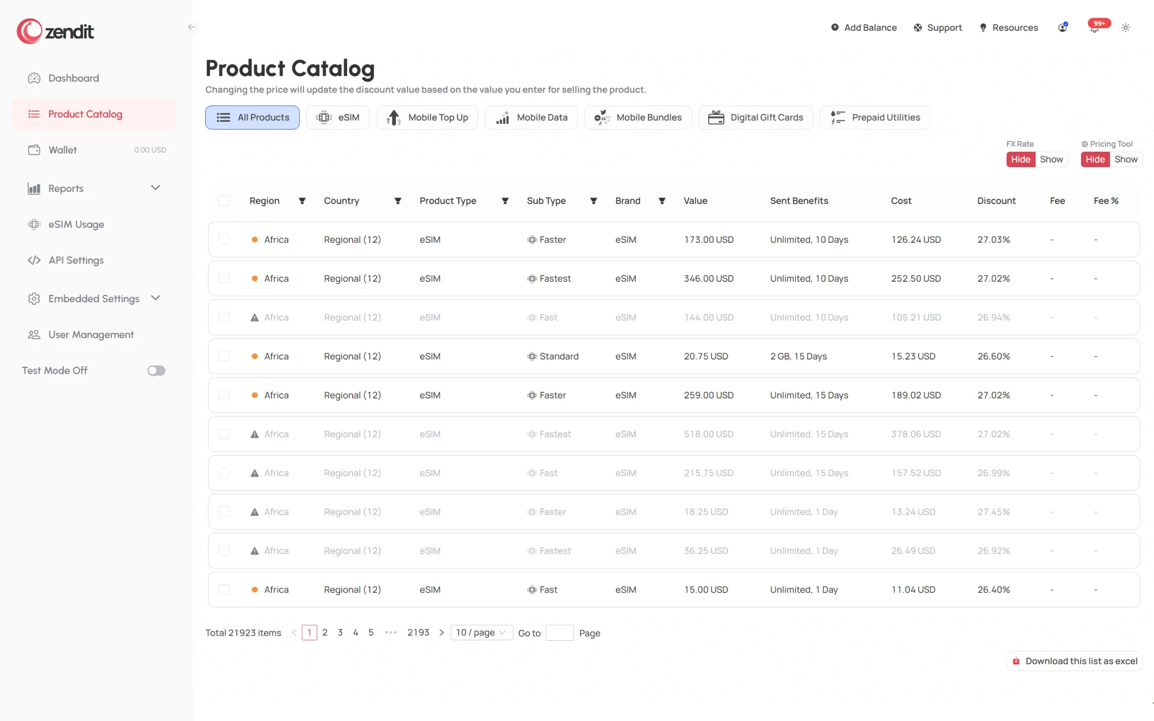
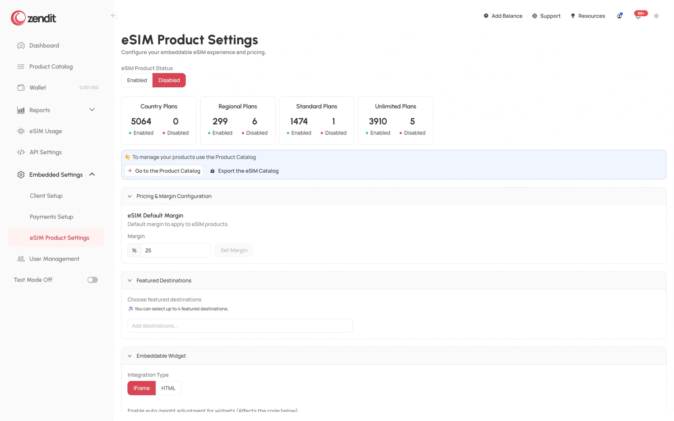
The catalog alone contained more than 16,000 products across 190+ countries. Operators also had to deal with availability, pricing, margins, balances, reports, alerts, users, currencies, and permissions.
The product was dense because the work was dense. I had to decide what needed attention now, what could wait, and which patterns should repeat. The brand also needed some personality without making financial infrastructure look like a toy.
- Keep high-volume tables readable without stripping away useful detail.
- Separate everyday actions from settings that could affect pricing or delivery.
- Use the expressive brand palette without letting it compete with product data.
- Make the same components work across customer-facing and internal tools.
The useful realization
Start with what customers are trying to do
“16,000+ products” sounds impressive, but it does not help someone picture the work. The story became clearer when I organized it around jobs: launch a new revenue stream, send a reward, keep a traveler connected, or manage products and balances.
That worked in the console too. I gave the common jobs priority: find a product, check availability, review a balance, change a margin, or investigate a report. Everything else could wait.
- Lead with a recognizable use case, then reveal the catalog behind it.
- Use real screens to answer questions that marketing copy cannot.
- Give operational status, balance, and exceptions visual priority.
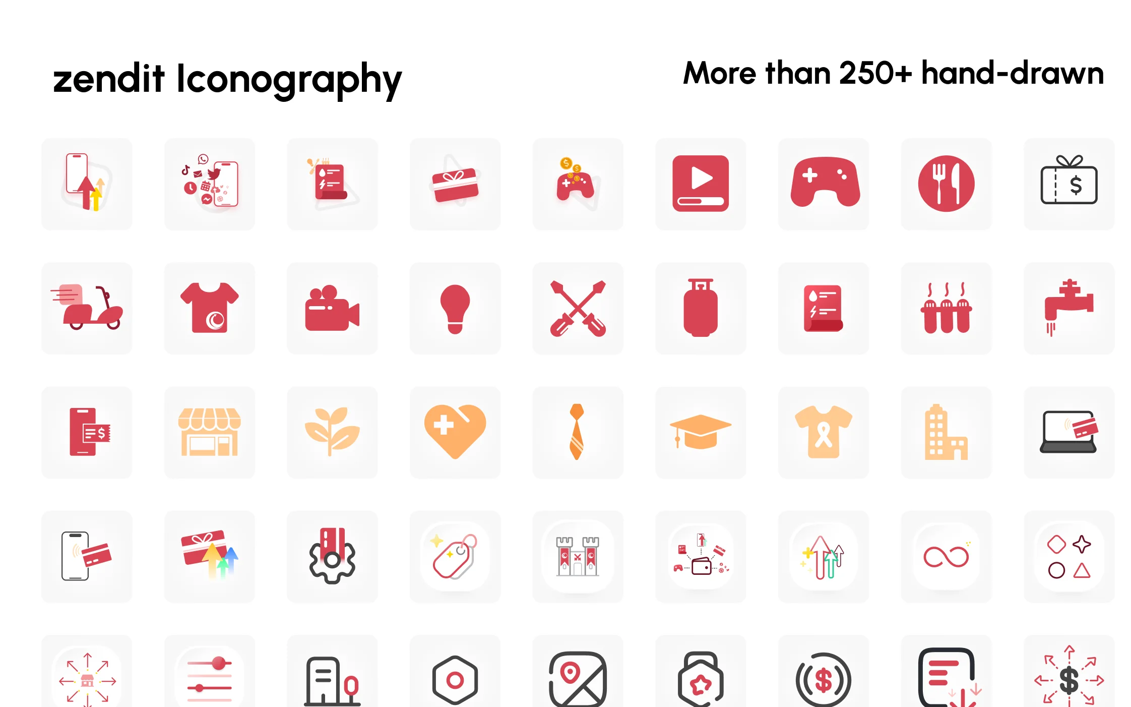
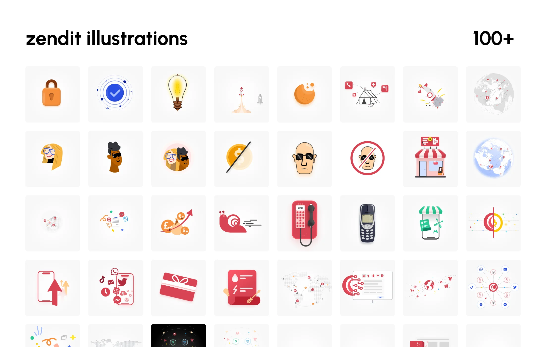
- Use icons and illustrations to explain categories, not to fill empty space.
How I worked
I designed the brand in the actual product
I did not finish the identity and then hand it over to product. I moved between the two. A color that looked good in a campaign had to remain useful in a dense table; a console pattern had to feel at home on the marketing site when shown as product proof.
Weak ideas showed up quickly this way. I built the website in the browser, designed the main console flows with real content, and turned repeated solutions into components, icons, illustration rules, and written guidance.
- Prototype the story and the interface side by side.
- Design with real catalog data and realistic edge cases.
- Turn repeated decisions into components and documented rules.
- Review the build so it still looked like the design after it shipped.
What shipped
What we actually shipped
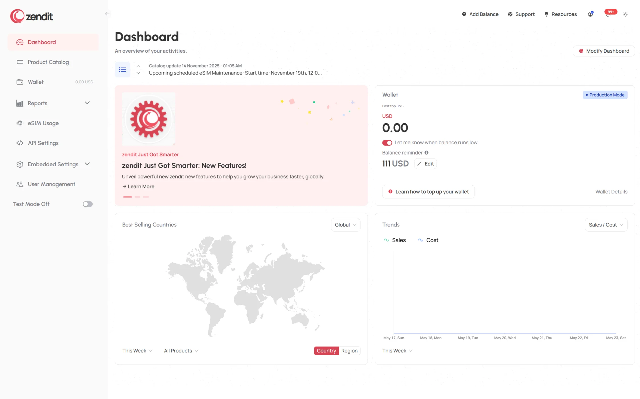
There was no dramatic reveal. We shipped an identity, a website and developer story, a client console for products and accounts, admin tools for internal operations, and a library of reusable visual assets.
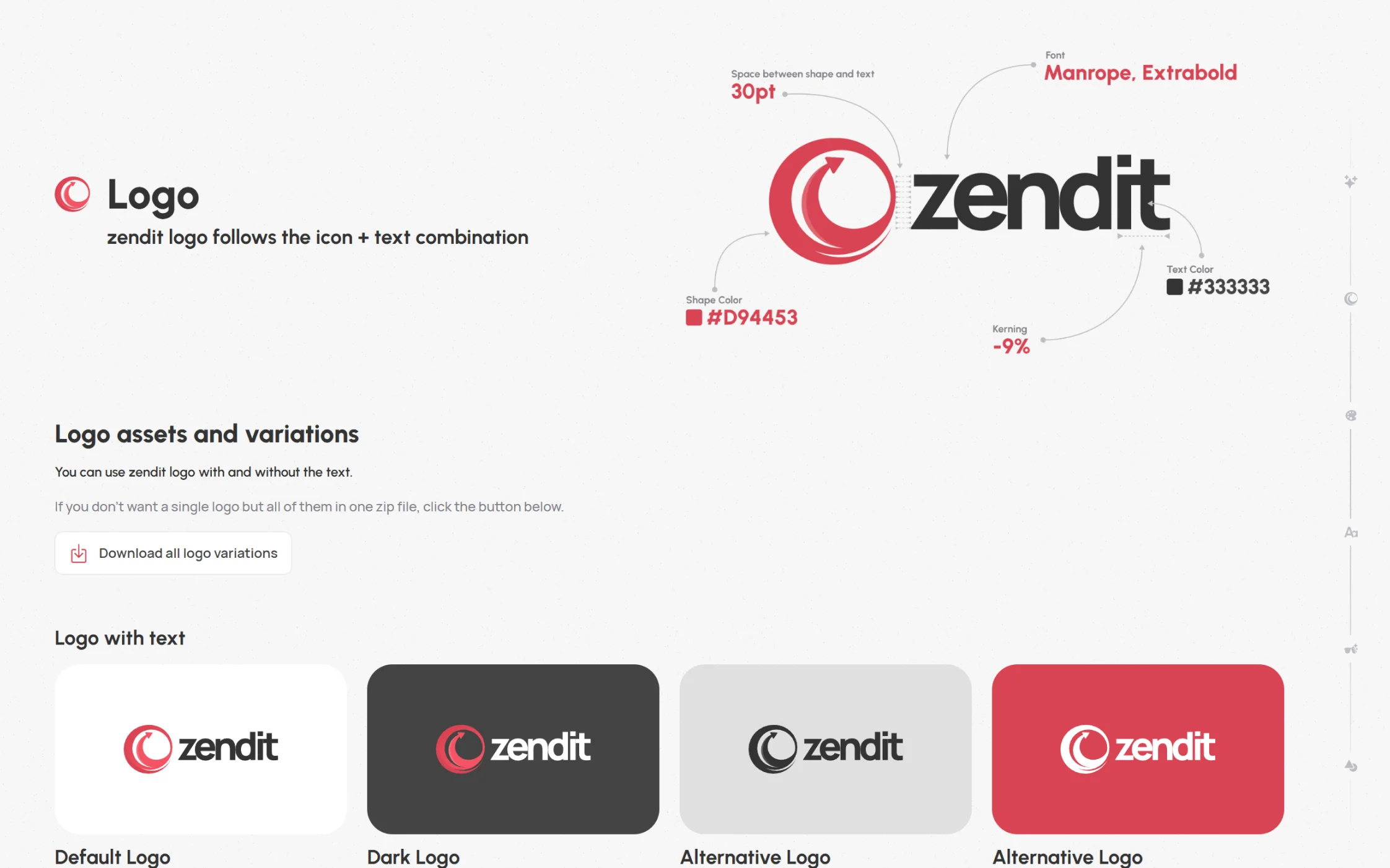
The cherry-red palette and hand-drawn illustration style made zendit recognizable, while the product stayed quieter and more functional. I reused the same type, spacing, components, and icon rules without forcing every screen to look like a marketing page.
A closer look
Website, console, and catalog
A brand mockup can make almost anything look good. The real test was whether it still worked beside a dense catalog, wallet balance, or settings form.
A closer look
Brand system, icons, and campaign assets
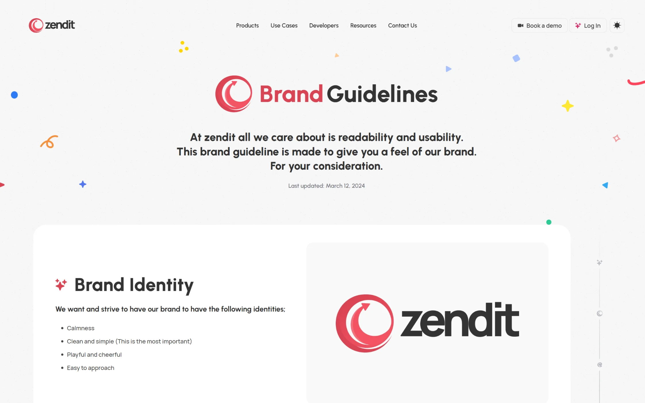
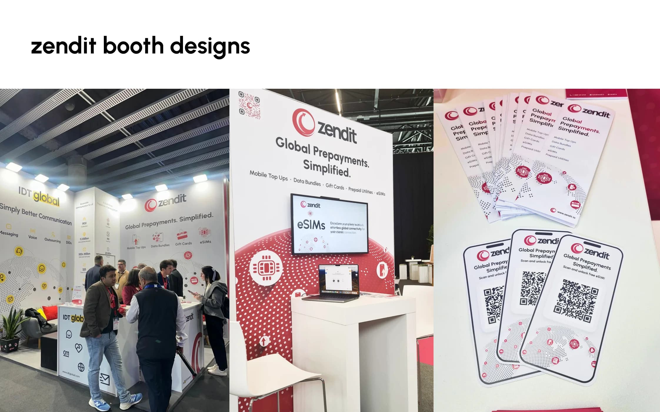
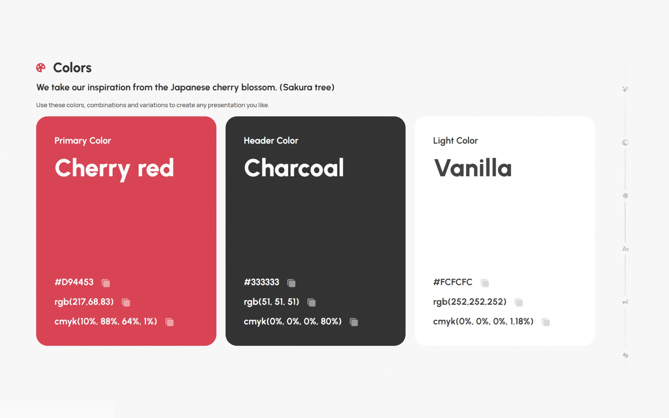
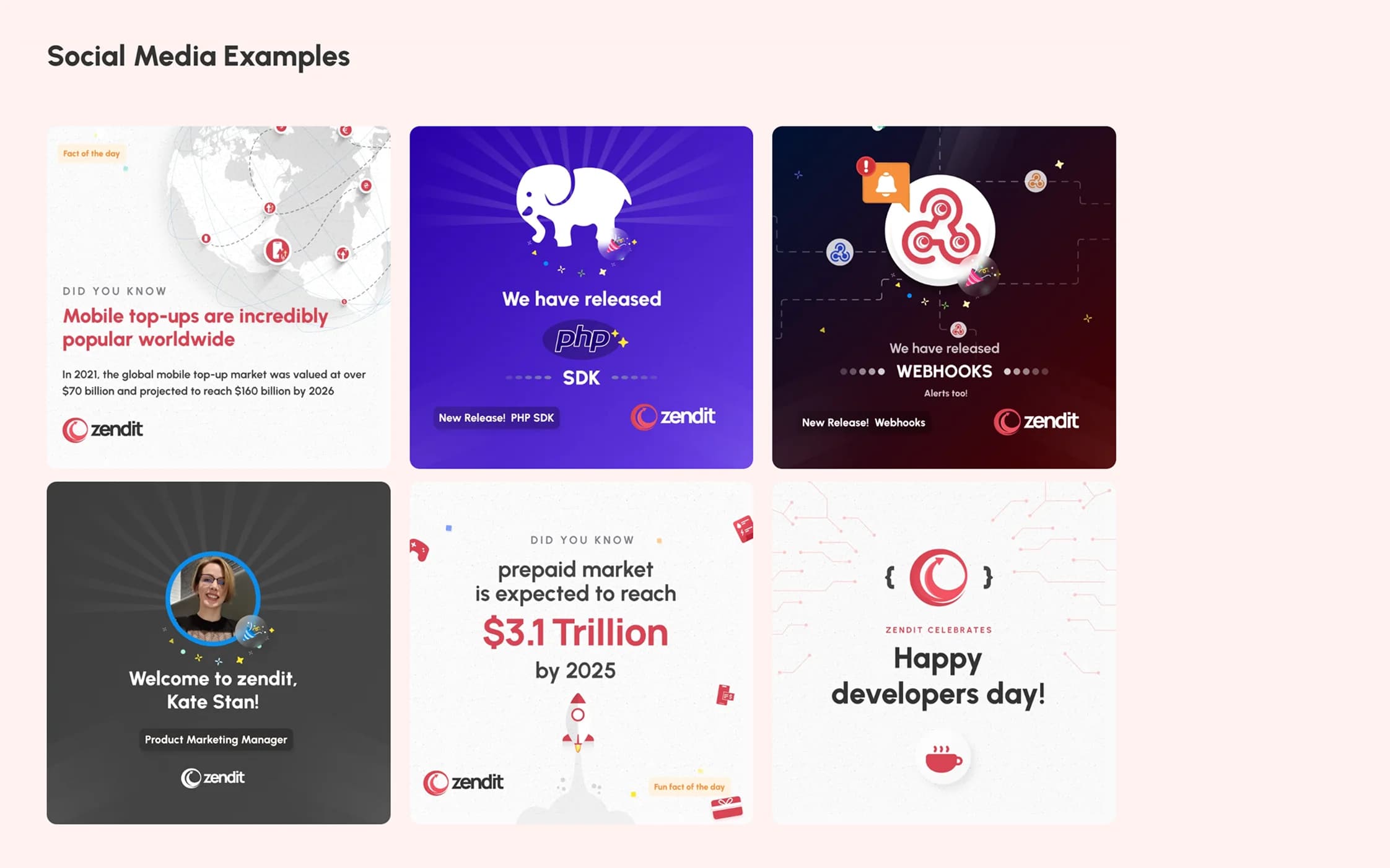
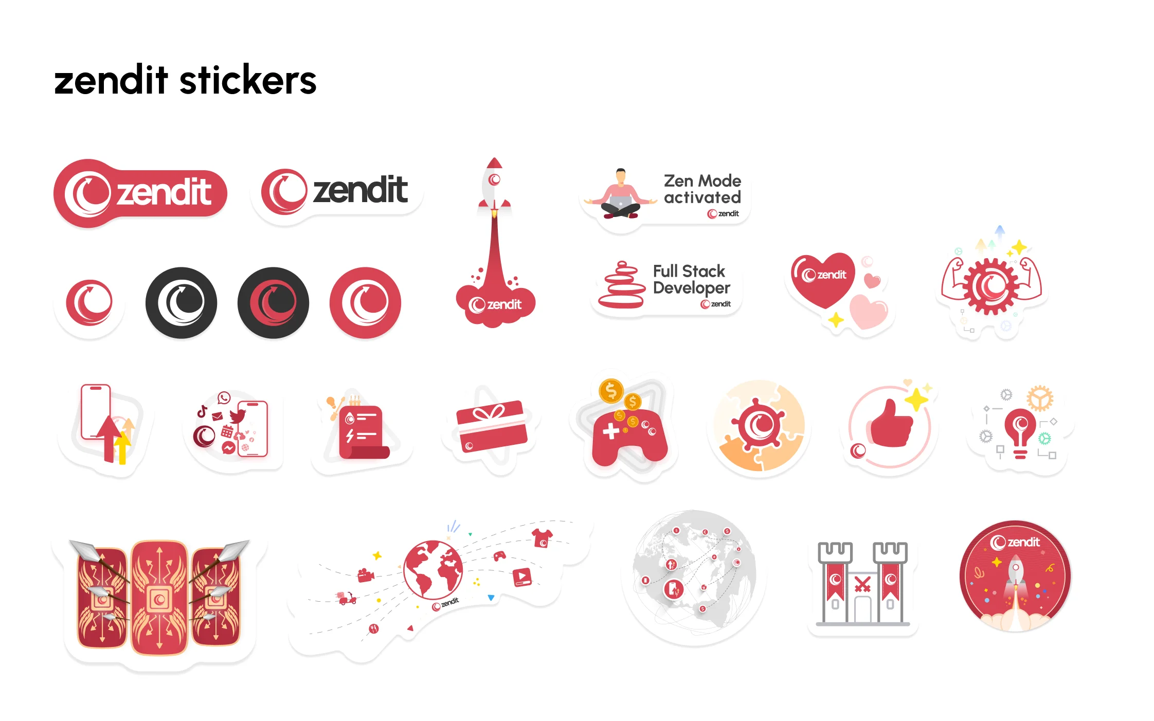
Then came all the things a brand needs after the launch deck: logo rules, colors, more than 250 icons, illustrations, campaign templates, stickers, and event material.
What changed
People stopped rebuilding zendit from scratch
Before this, zendit had a powerful platform, but every new page or screen had to work out what zendit looked like again. Afterwards, product, engineering, marketing, and sales could draw from the same set of patterns and assets.
As the work grew, new pages, console features, campaigns, and event material could start from something proven. The guidelines did not do anyone's job for them. They just stopped every new page becoming another debate about which red to use.
- A simpler product story for buyers, partners, and new team members.
- Real interface screens that sales and marketing could use as proof.
- Shared components and visual assets across client and admin products.
- Guidelines that reduced one-off decisions in new pages and campaigns.
Looking back
A logo is easy. The product is the real test.
A brand can look brilliant in a mockup. Then you put it beside a table with thousands of products and find out whether it actually works. Designing the identity and the console together kept both honest: the brand could not become theatre, and the product could not become anonymous.
I would use the same test again. Can the idea explain the business in ten seconds? Can it survive the messiness of the real product? If yes, keep it. If not, back to Figma.
The bit that mattered
The brand got better when I stopped treating it like a separate project. A color had to work in an announcement and in a table full of product data. If it could not do both, it was not a system. It was a moodboard.